Brand Architecture - Design Strategy - Naming Strategy - Concept Development - Key Visual Development - Illustration - Graphic Design - Packaging Design - Adaptation Design - Artwork
Client: Procter & Gamble
Brand: Gillette Venus
Project: Venus Daisy
Gillette Venus wanted to establish a much stronger presence in parts of Asia. Here they had launched several products over the past decade with a successful consumer following but no brand architecture and design strategy. Whilst Gillette was a well-established brand, female consumers did not pay particular attention to the difference between Gillette for men and Gillette Venus, also being more familiar with the name ‘Daisy’ which had previously scored higher in consumer testing vs. Venus. Finally, consumers had little knowledge of the difference across variants, not understanding the product benefits and hence only focusing on price.
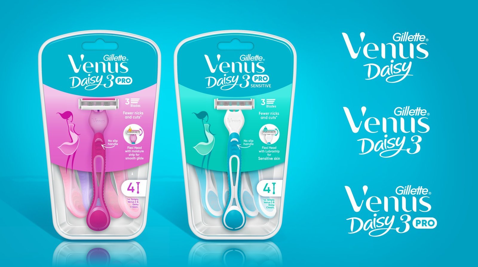
Our client was additionally looking to introduce a more premium product onto the market, offering a flexi head with build-in moisture strips for a smoother shaving experience.
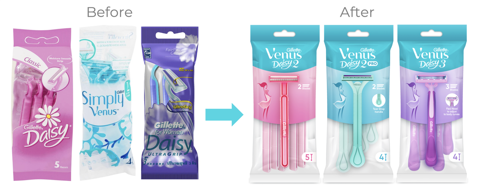
We worked with the P&G Southeast Asian Marketing team to establish several different scenarios toward what the most coherent and consistent brand architecture would be. Our key objectives were to achieve clarity of product offerings in the marketplace and increase the Gillette Venus brand equity.
Consumer insights revealed the strength of the ‘Daisy’ product name which became important to keep. Better visibility of the actual product and a consistent packaging system across all packaging was an immediate observation noted. Finally, many consumers commented that it was not clear to them which products were for males and which products were specifically developed for females. In a region where shades of pinks and purples are as much for men as for women, relying solely on such commonly used colour reference would not be enough. Neither would photography of women shaving their legs or armpits, as such images are considered inappropriate within the region. Still, it would be important to explore subtle cues to make sure our designs looked and felt more feminine and attractive.
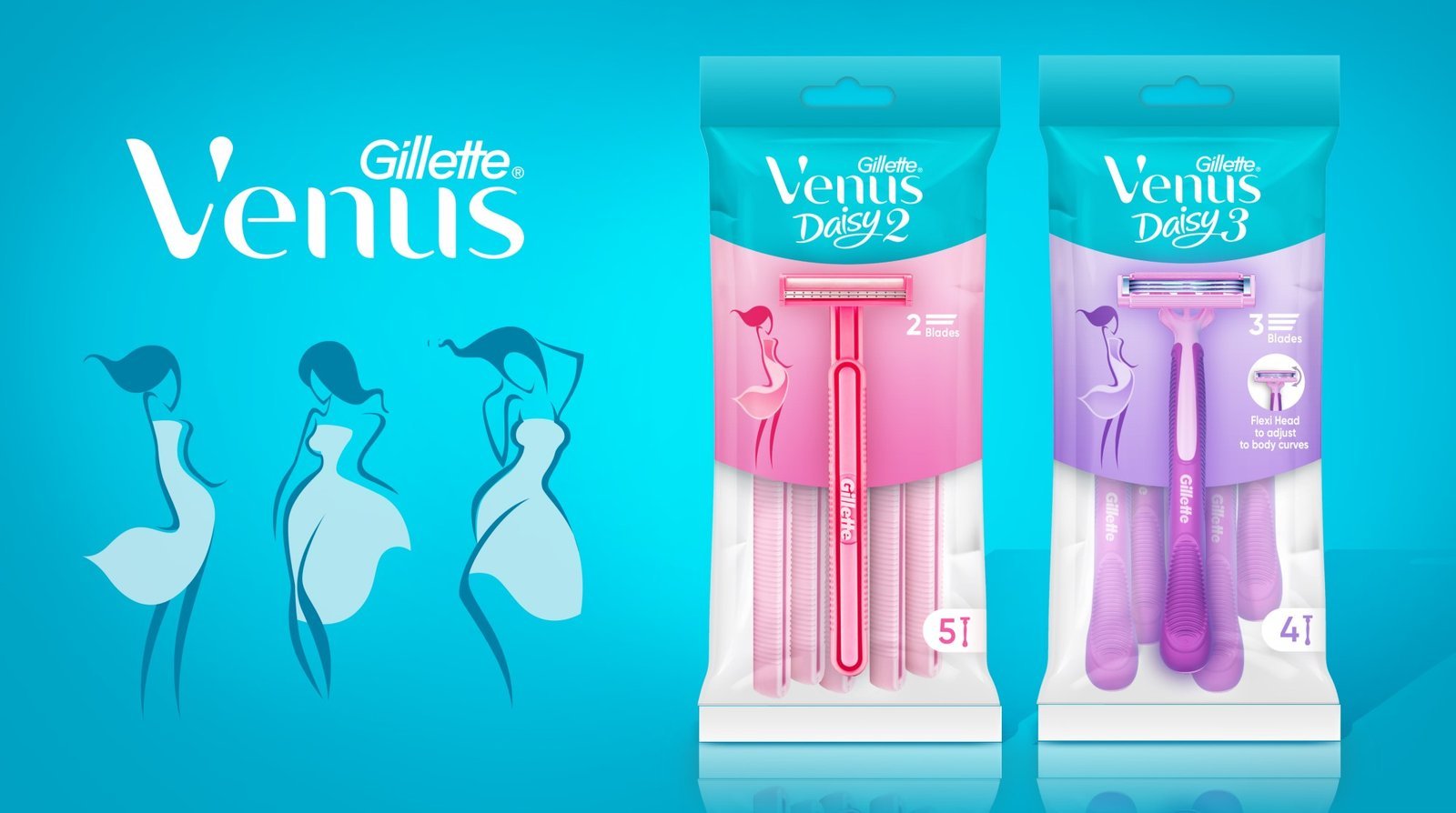
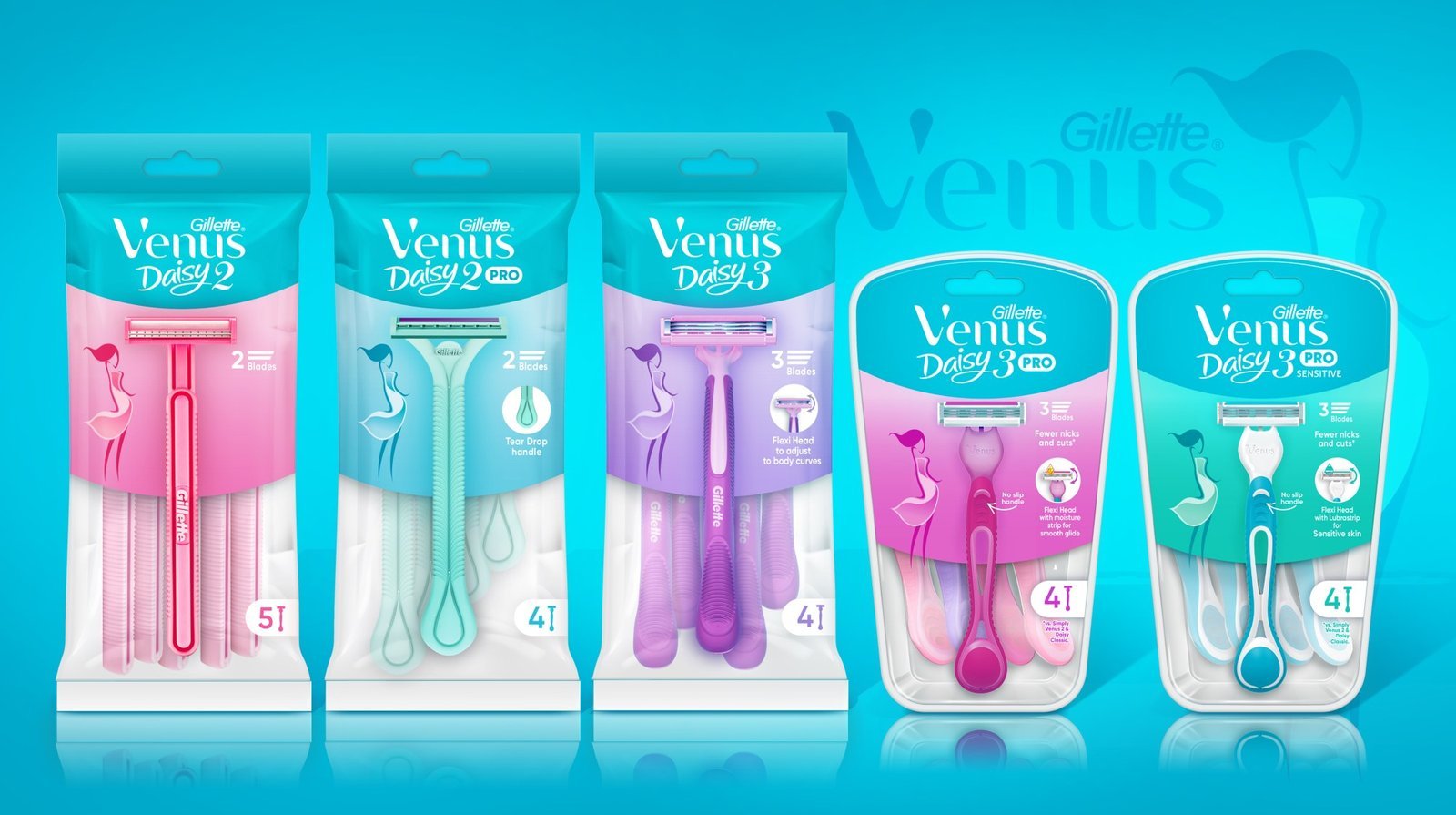
Consumer testing uncovered that introducing a new packaging format for the new premium range would be essential to differentiate the new product vs. the existing ranges which were in bags. Thus, our client decided to introduce the blister packs, immediately setting the new product apart visually within a more sophisticated form. We then moved onto establishing a tier 1 and tier 2 product offering, each with a ‘PRO’ sub-nomen to communicate any added product value within each tier, allowing for some existing products to still be differentiated as having a higher value vs. other products in the marketplace.
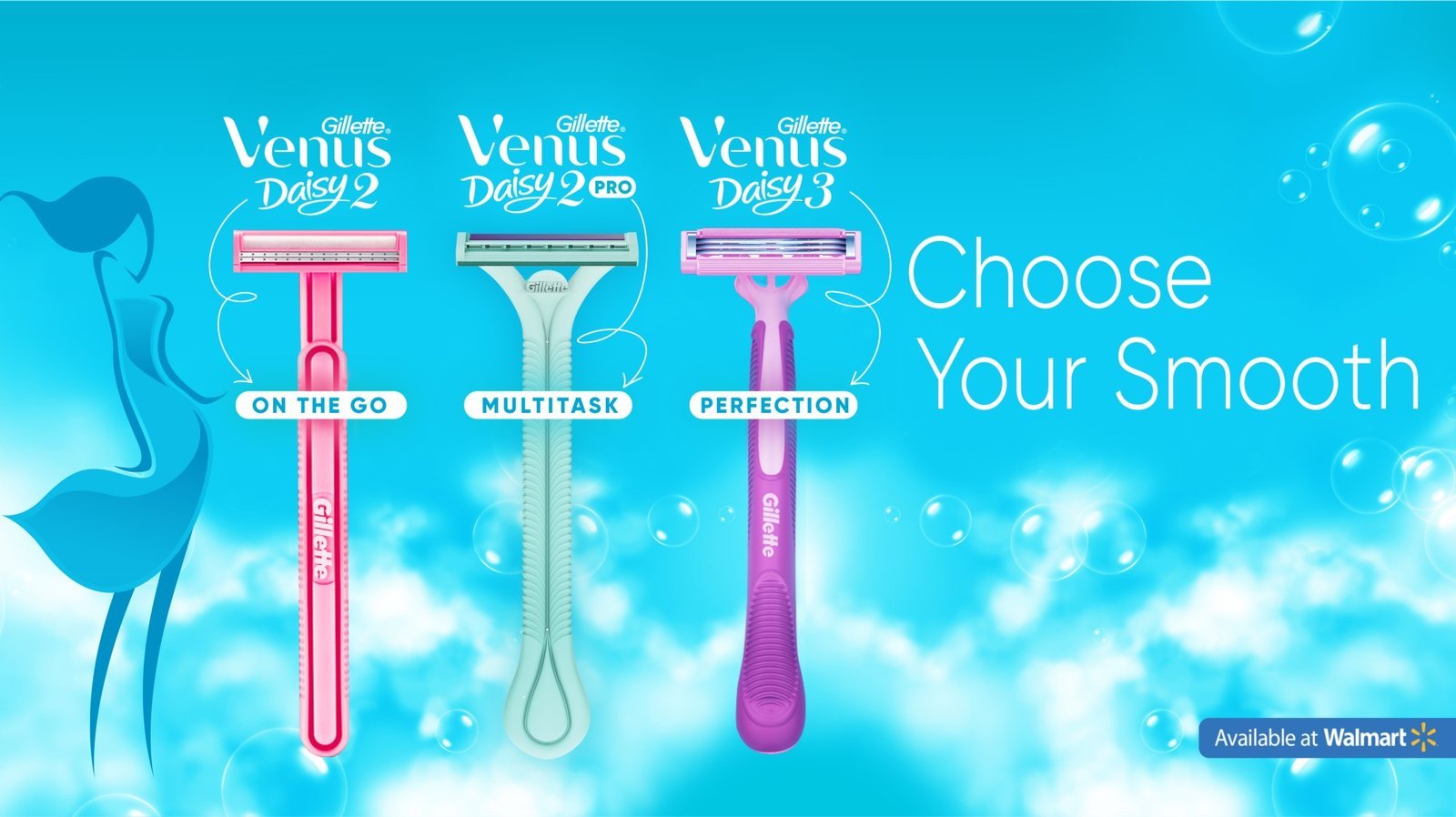
Based on the winning strategy voted by consumers, we launched with Gillette Venus Daisy 2 as a tier 2 product offering and Gillette Venus Daily 3 as a tier 1 offering. Working on smaller size packaging made it extra important to stand out at shelf. Hence, we made sure to introduce a strong brand blocking approach at shelf, supported by a rainbow colour strategy with clear unifiers and differentiators at FMOT. The actual product differentiators were optimised with a simulation of each shaver being heroed on the front of pack, supported by a simple feminine silhouette to the left, and an intuitive icon to the right, introducing the product benefit.
