
Design Strategy - Focus Group - Naming Strategy - Visual Identity - Concept Development - Key Visual Development - Graphic Design - Packaging Design - Adaptation Design - Artwork
Client: Hybrid
Brand: PUMP
Project: Advanced Sports Supplements
HYBRID Software is an enterprise software development company focused on innovative productivity tools for the graphic arts industry. With offices across Europe as well as the United States, China and additional global partner networks, their software solutions are used by thousands of customers worldwide in all areas of prepress & print, including labels and packaging, folding cartons, corrugated, wide format and digital printing.

With several global Hybrid clients within the Sports, Health & Wellness category, we were asked to develop a sports drink branding proposition to be brought to life across 3 variants, each with their unique added value and relevance to athletes and sports teams engaged in competitive training.
Working with client representatives from a select group of sports clubs, gyms and health supplement brand owners, we explored visual identity systems that would avoid the stereotypical look and feel of body-building brands and instead focus on the demanding physical strength required by sports people to achieve their goals. Our client representatives were keen to explore a step-by-step tailor made nutritional sports drink regimen towards replenishing your body with key electrolytes such as magnesium, potassium and sodium to hydrate and support your body and mind during and after strenuous exercise.
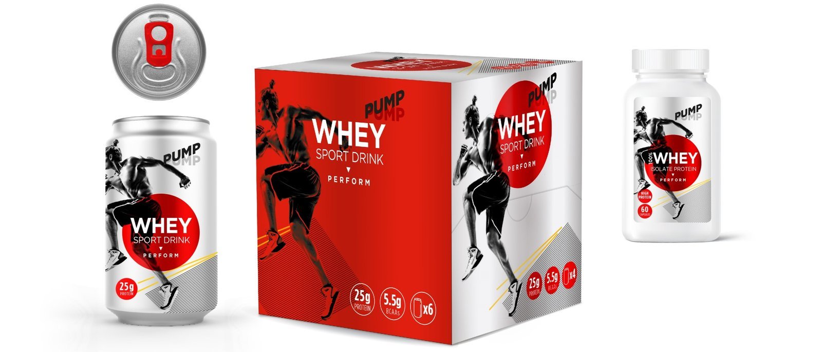

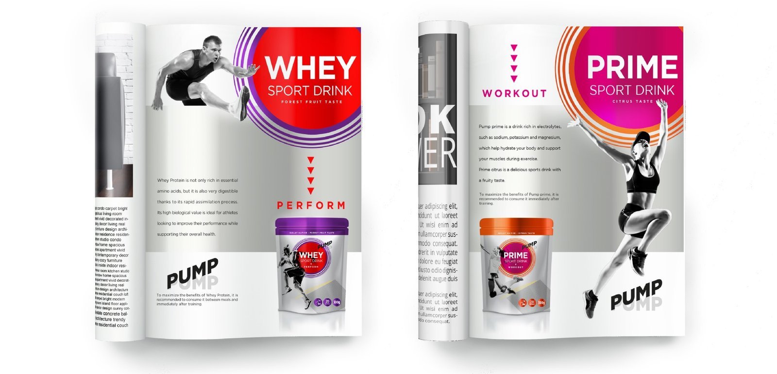
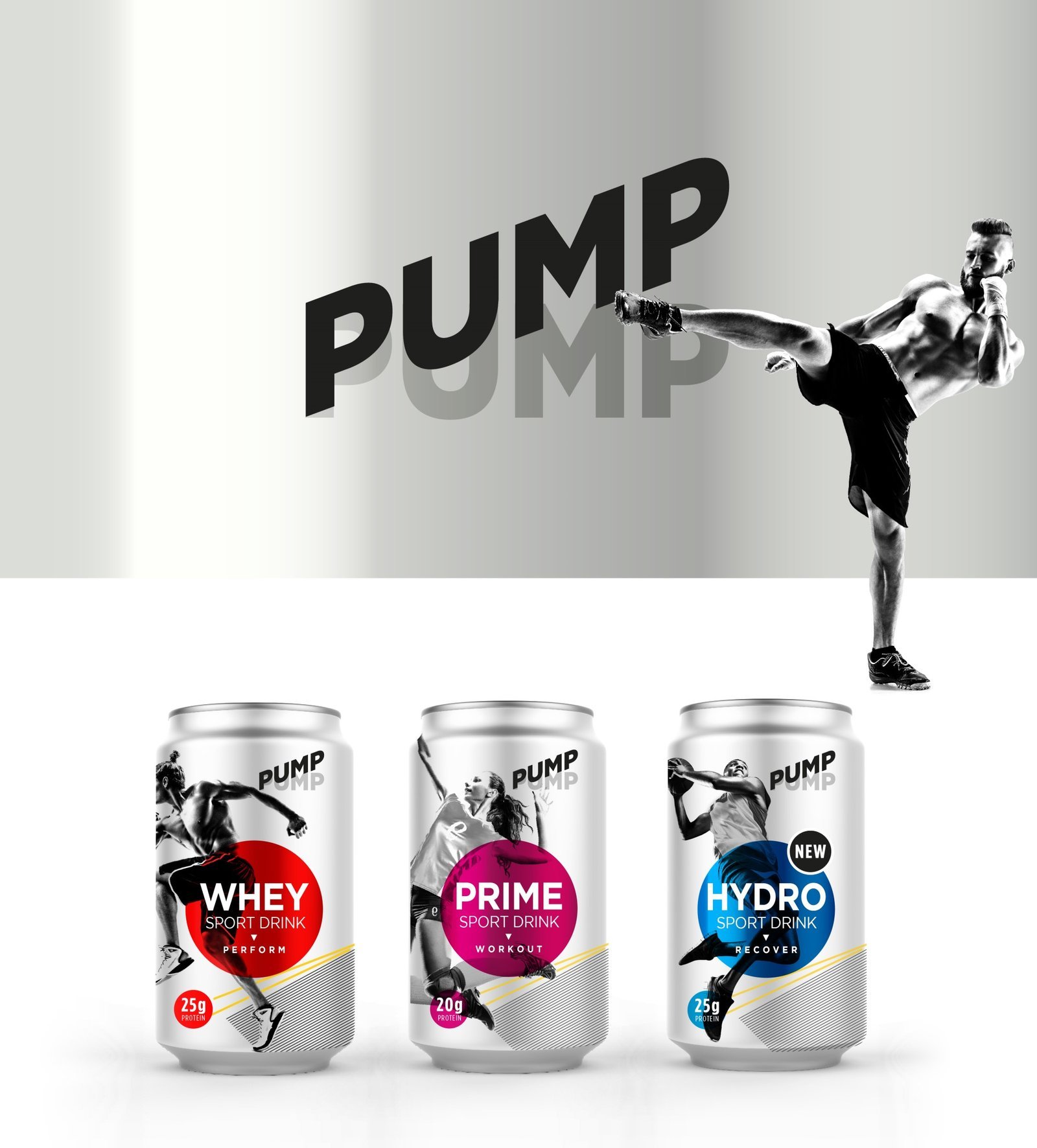
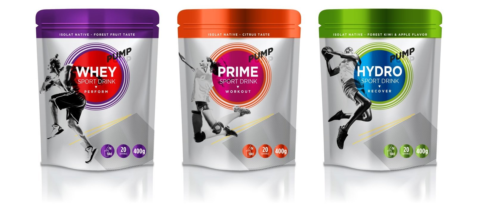
The packaging design would be sold B2B so sports organisations could customise the product for their own branding, hence we focused on a simple but impactful visual expression of dynamic B&W photography of male and female athletes set against a matt metallic light grey background. The product names of WHEY, PRIME and HYDRO where heroed within a semi-transparent capsular shape in a glossy metallic vivid colour per variant, creating a strong focal point and RTB as well as an effective contrast against the rest of the matt packaging. Sub-categories such as powder forms were further differentiated by a bullseye effect around each of the product name capsular shapes to signal a different form. Finally, we elevated the premium look and feel with a gold and charcoal metallic ink pattern, positioned bottom left throughout the design, creating a sense of depth and movement.
The result? 374 orders placed at the first event show over 2 days. Beat that!
