Design Strategy - Concept Development - Key Visual Development - Illustration - Graphic Design - Packaging Design - Adaptation Design - Artwork
Client: Procter & Gamble
Brand: Lenor FE / Bold Detergent
Project: Mrs Hinch Frosted Rose Wonderland
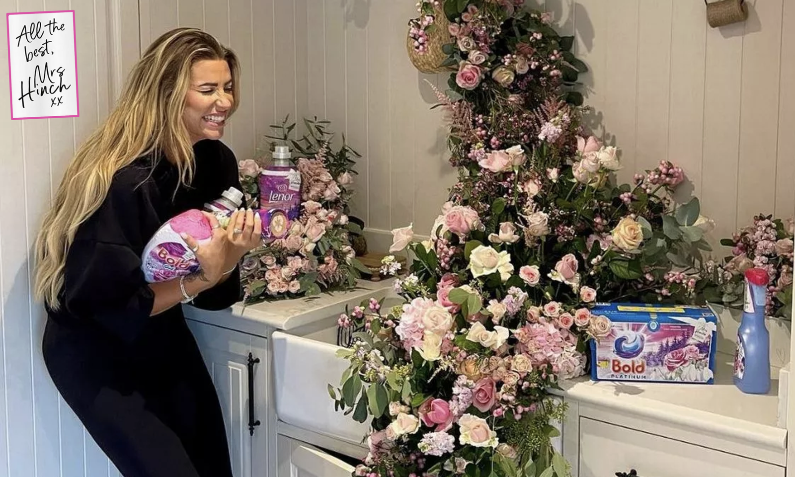
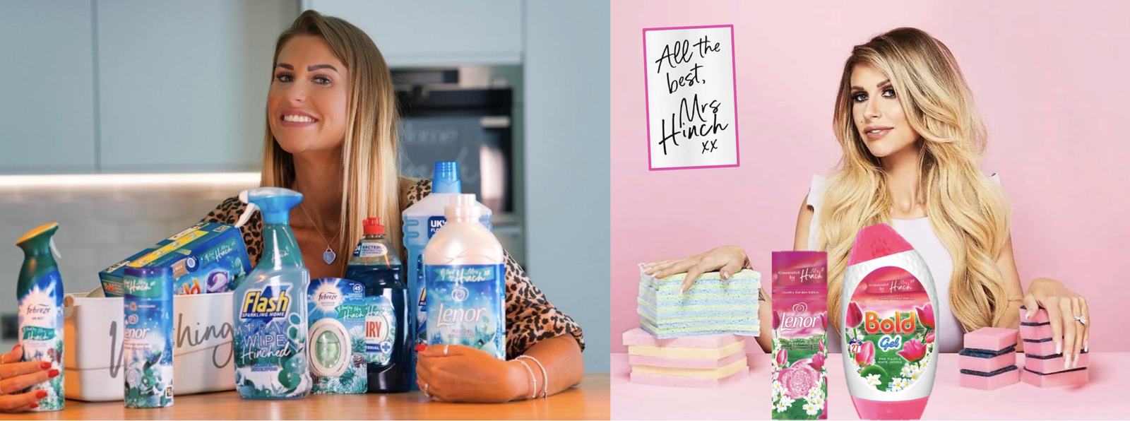
Probably no introductions needed for the sensational Cleaning Queen Mrs Hinch in the UK. Sophie Hinchliffe is a British influencer whose instagram account features tips for home and laundry cleaning. Her cleaning books have been included on the Sunday Times Bestseller list, a self-made millionaire at 34, Mrs Hinch is also a passionate scent-seeker who looks to combine immaculate cleaning tips with superior products such as those in the Proctor & Gamble Laundry and Home category.
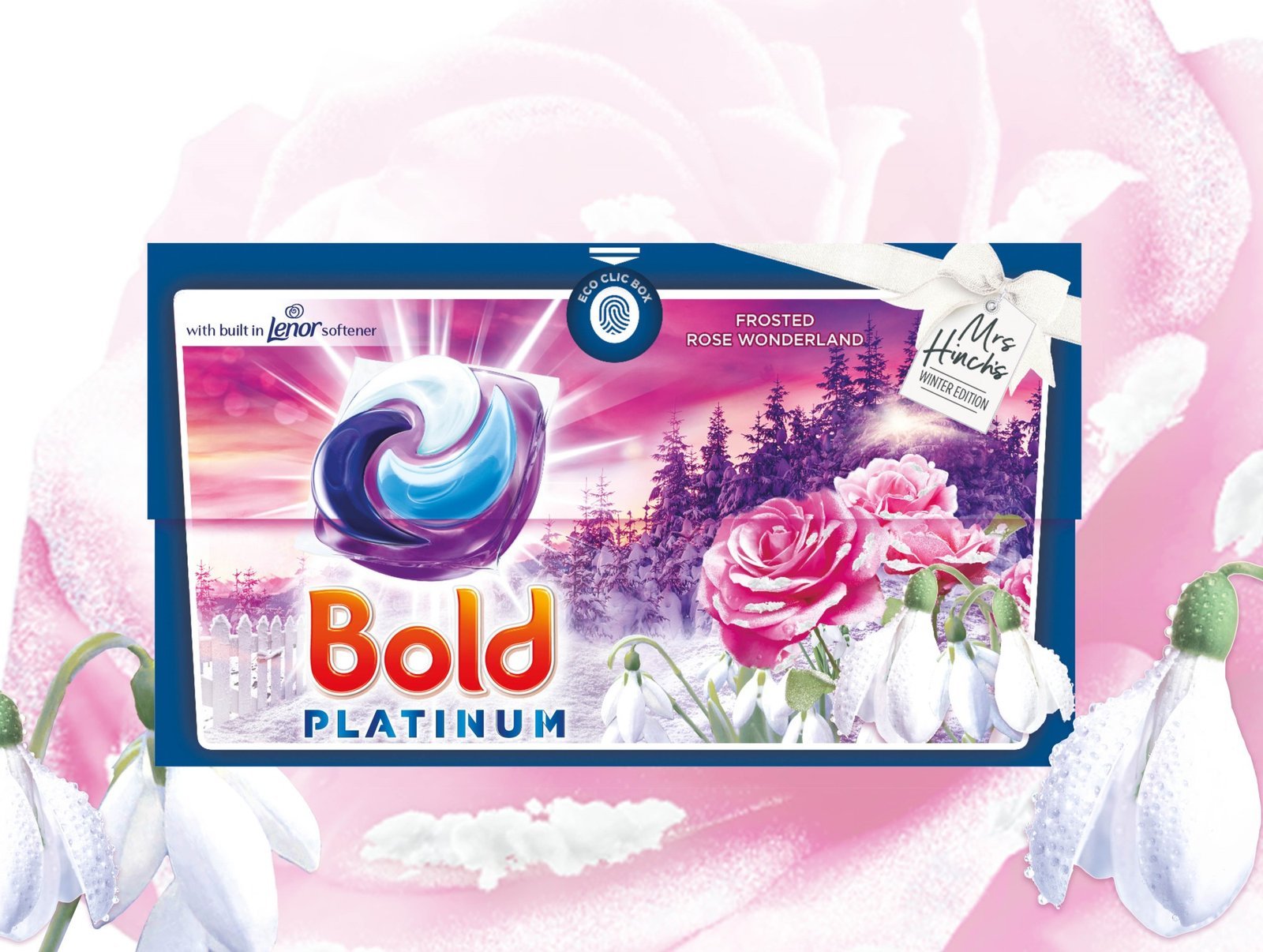
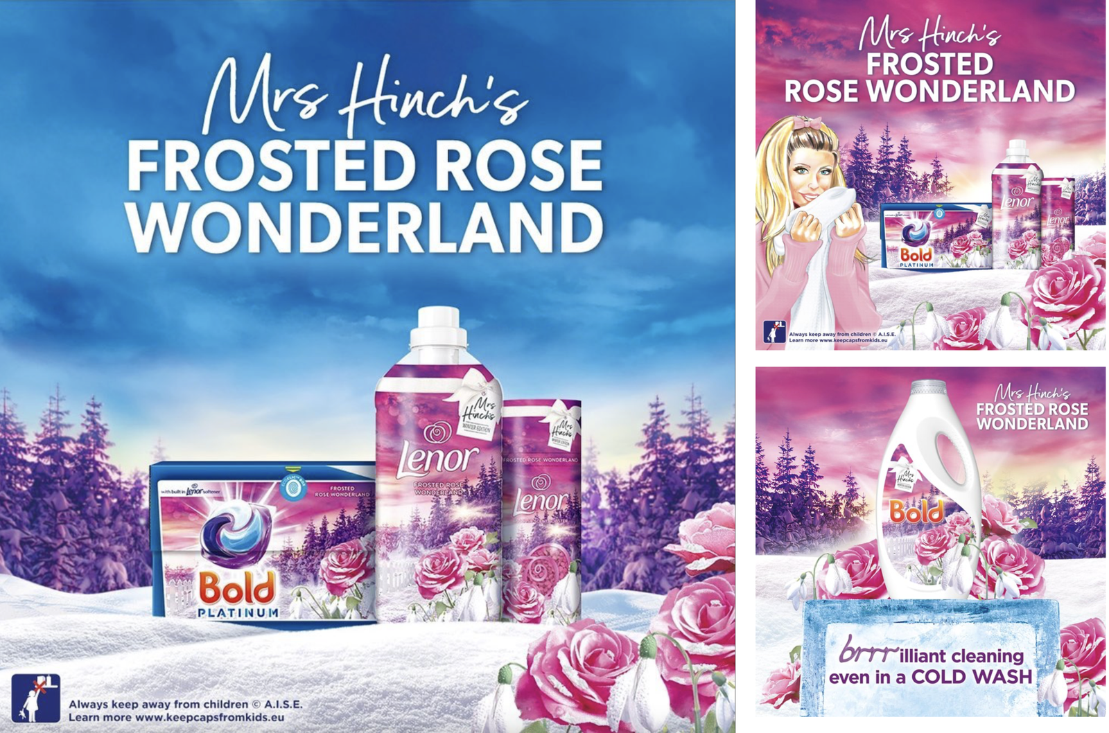
Following the huge national success of our previous Mrs Hinch limited editions, and the latest innovative 4-compartment liquid-POD from Proctor & Gamble, Mrs Hinch wanted to launch a new scent to capture the fresh sensation of walking in her garden at sunset, down towards the forest in the freshly fallen snow, amidst frosted roses and snowdrop florals. She was looking for a landscape that would bring to life the magical beauty and dreamy sensation of this enchanting experience to share with her loyal followers.
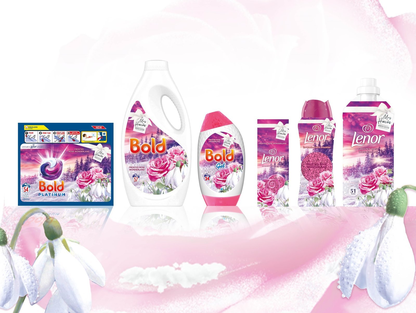
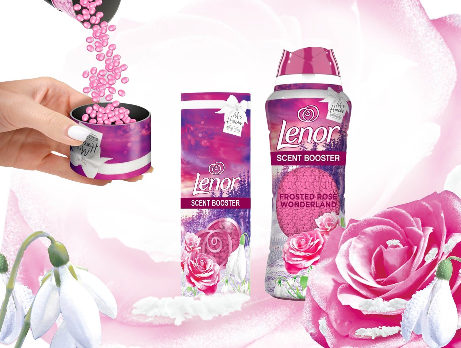
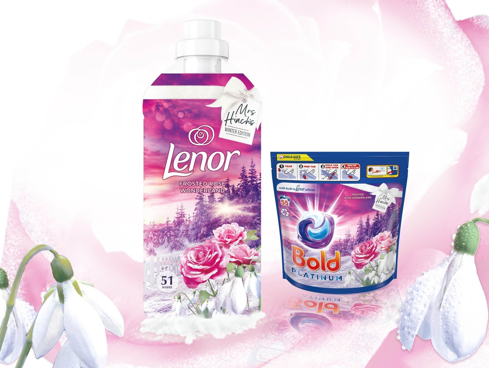
Working across several brands, it was key to develop a design that could be brought to life with the same look and feel across both size formats and forms, but also different substrates and printing techniques. The ‘Perfect Match’ line-up would be spread out across shelves in the Fabric Care Category according to brand and product so it was also desirable that the design would unite these at FMOT and immediately stand out as a one family, each bringing their own individual added value to your laundry experience.
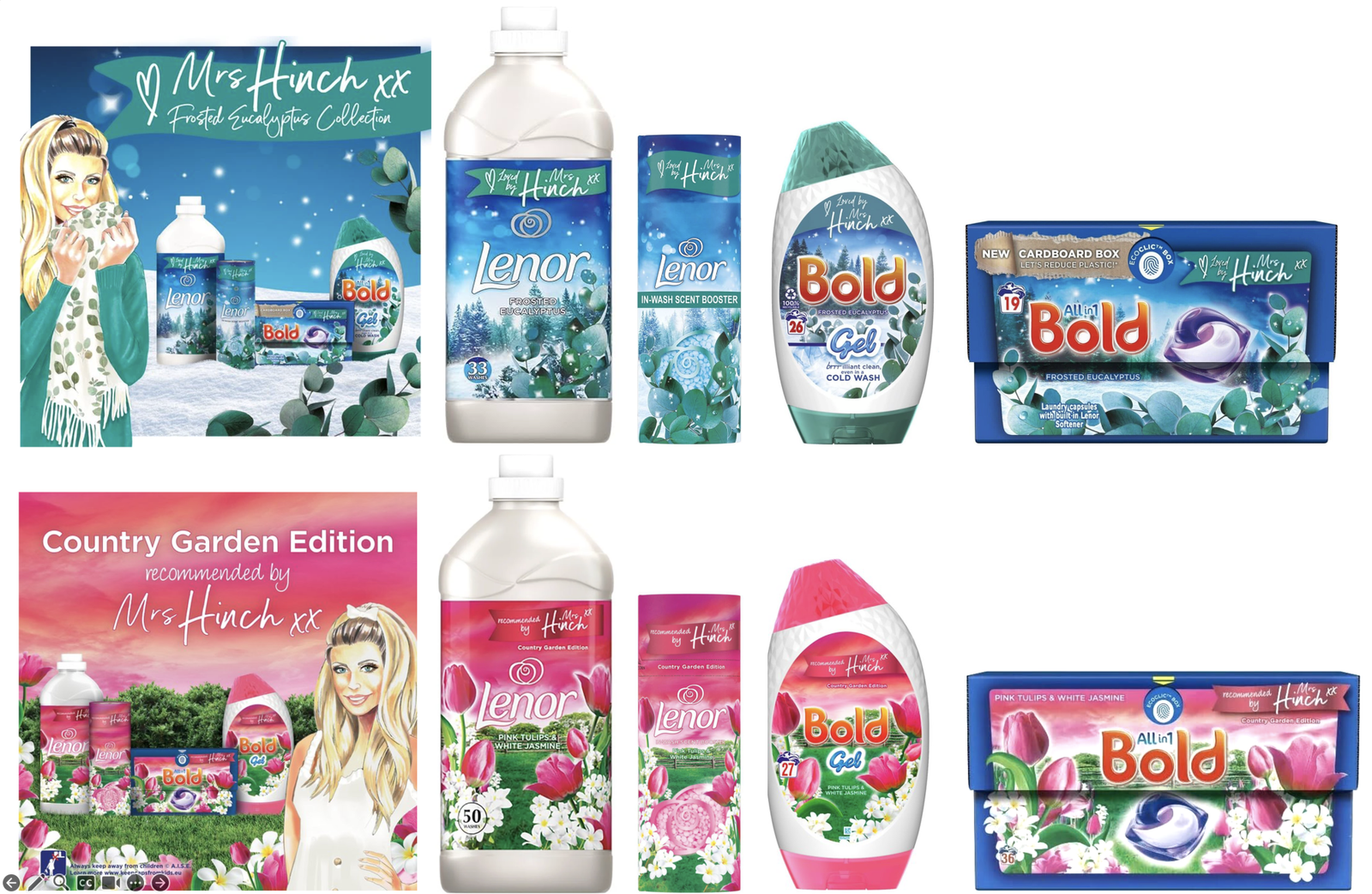
Heroing the new liquid-POD, we created an ownable limited edition logo for Bold, one of Proctor & Gambles premium laundry brand. It was important to look and feel different vs. the base line-up of the brand, as this new design would also be the first in a new PLATINUM line-extension. Freeing the Bold wordmark from its traditional yin & yang symbol, we teamed up the POD and wordmark as a visually impactful brand asset in its own right, bringing the efficacy of the POD to life amidst rays of light emanating from the power of the POD to reinforce its premium freshness and superior cleaning abilities. Finally, we visualised fewer but larger ingredients at the front of the design, strengthening the scent communication in a precious way as if you’re right there in the garden yourself, exactly what Mrs Hinch wanted her followers to feel like, as they take a walk in her rose and snowdrop garden at sunset.

