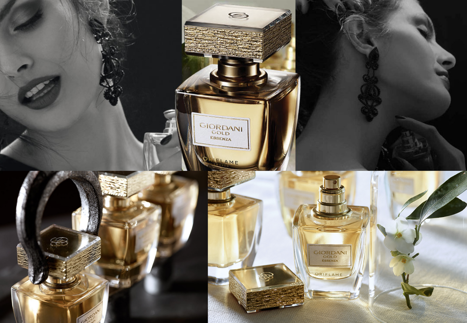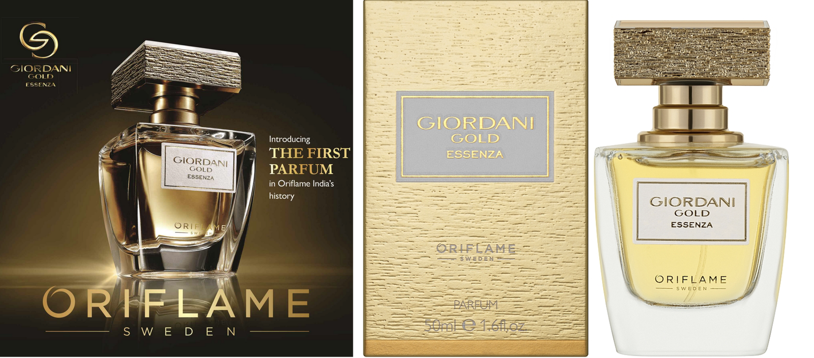
Brand Positioning - Brand Architecture - Design Strategy - Visual Identity - Concept Development - Key Visual Development - Structural Design - Illustration - Graphic Design - Packaging Design - Adaptation Design - Photography
Company: Oriflame
Brand: GIORDANI GOLD
Project: Premium Femininity
Oriflame wished to relaunch Giordani Gold; one of the most important brands within its cosmetic portfolio.
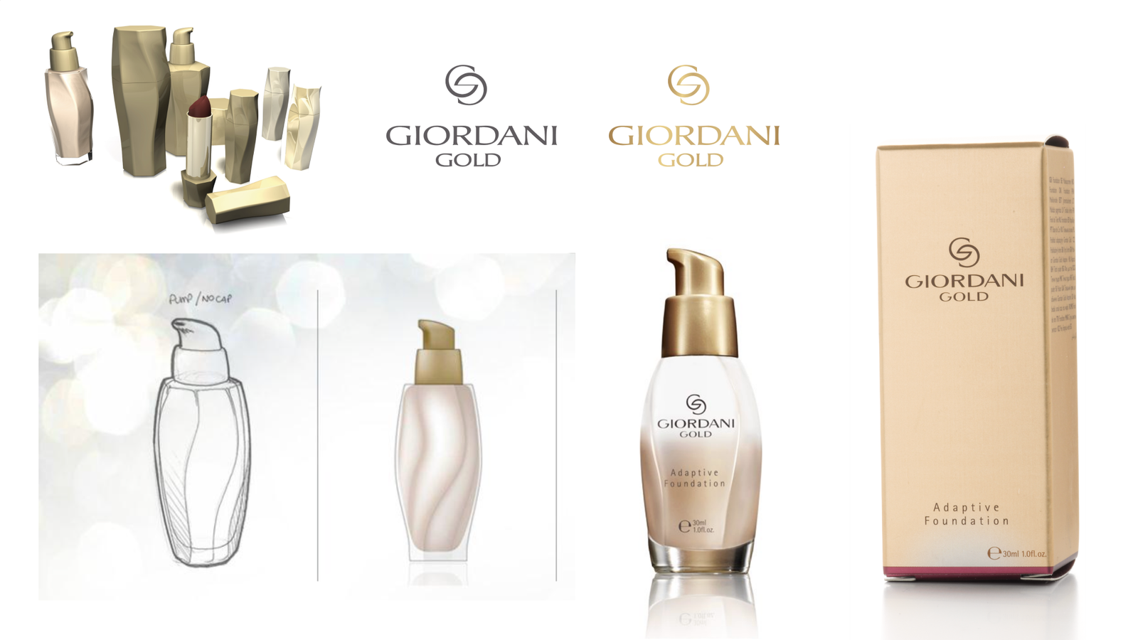
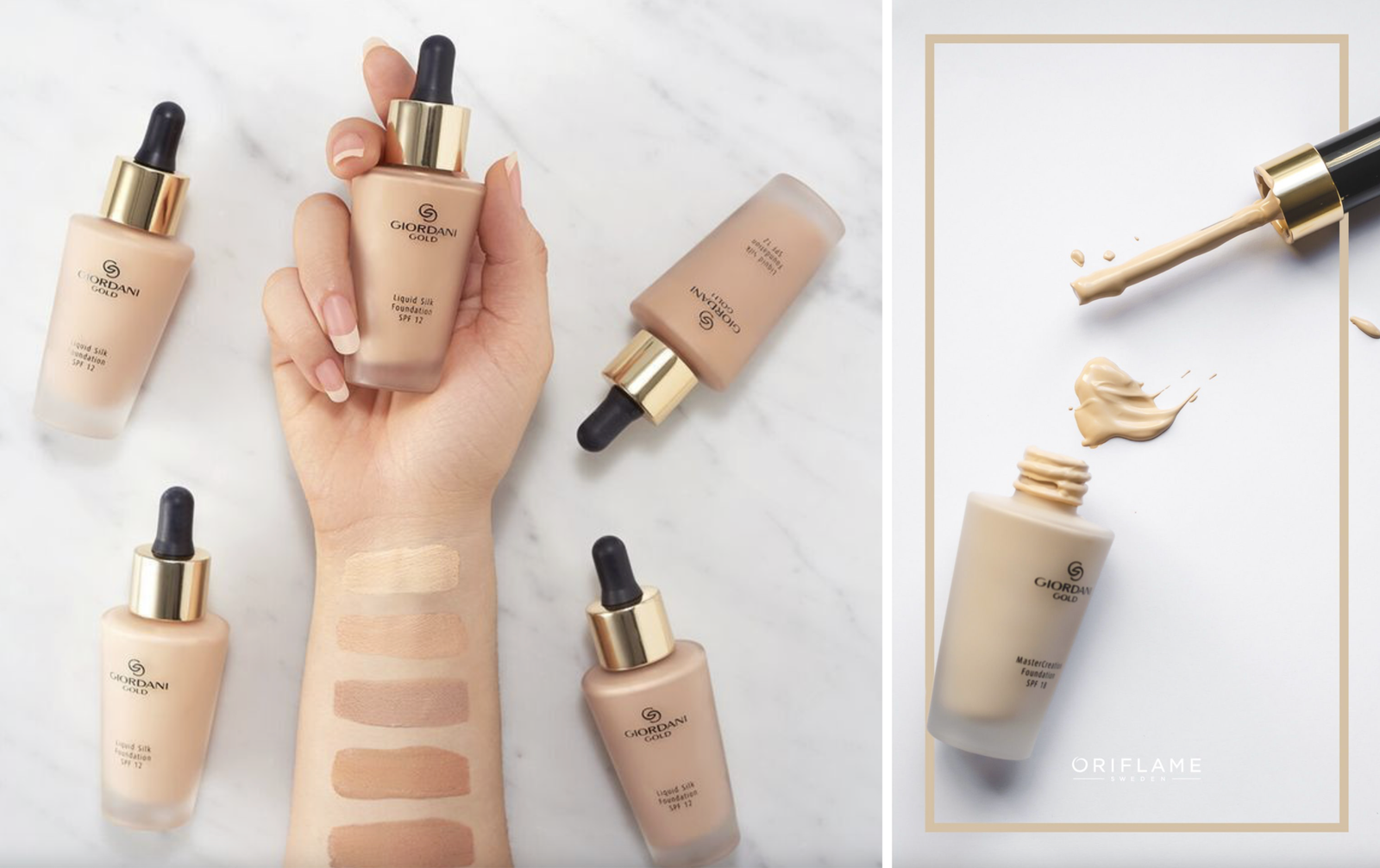
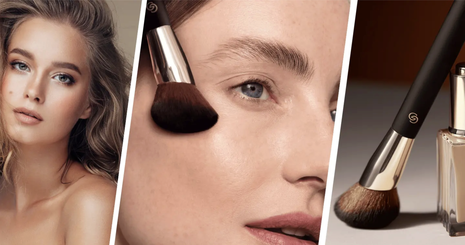
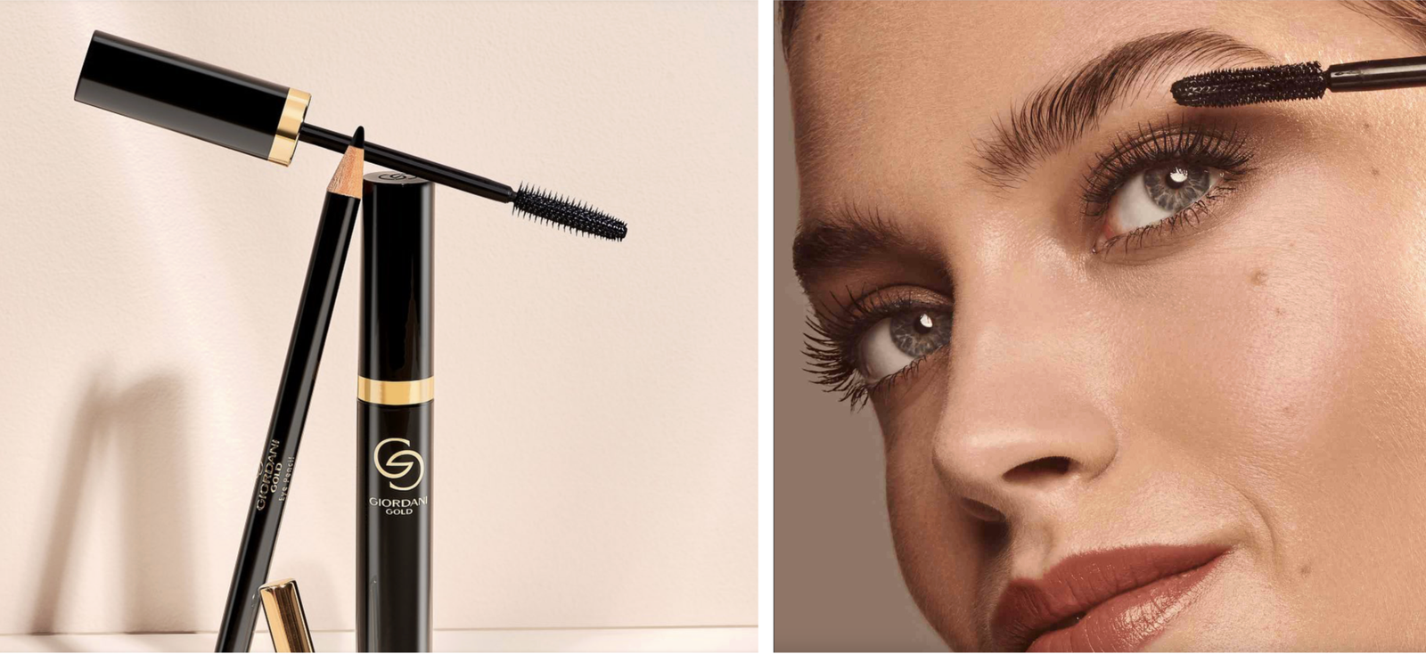
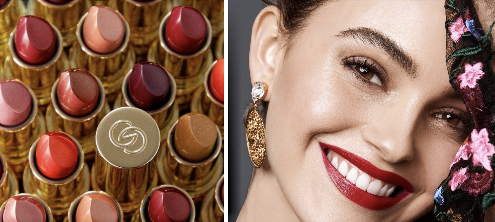
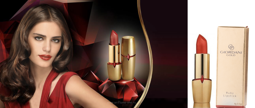
Based on the winning positioning of ‘fulfills my femininity’, Oriflame asked us to revamp the Giordani Gold brand identity to look and feel more alluring as well as iconic.

Our core mission was to elevate and reinforce the elegance and feminine sophistication of the brand, by creating an impactful and ownable visual identity within the category, enabling us to build a truly holistic brand language.
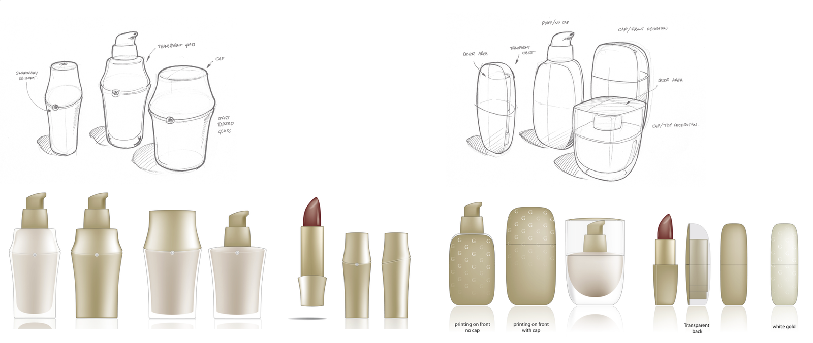
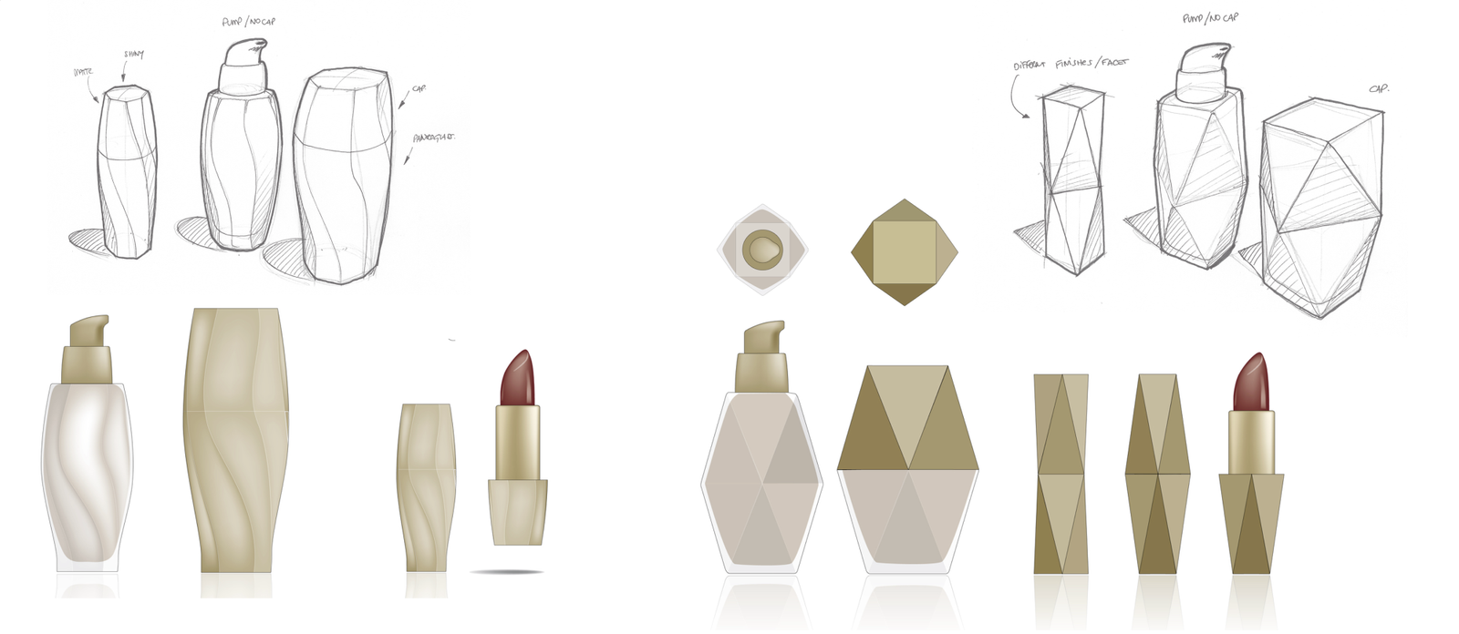
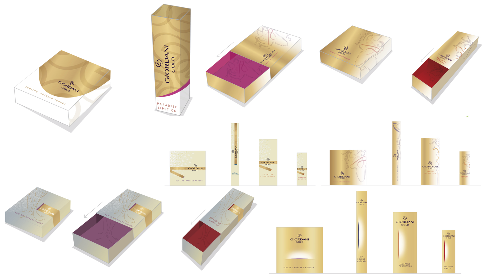
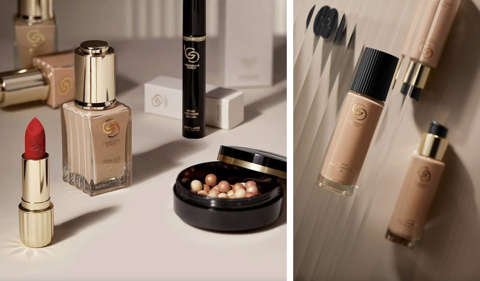
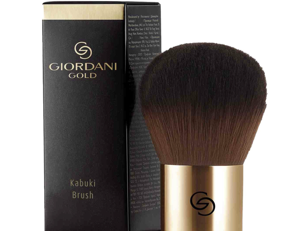
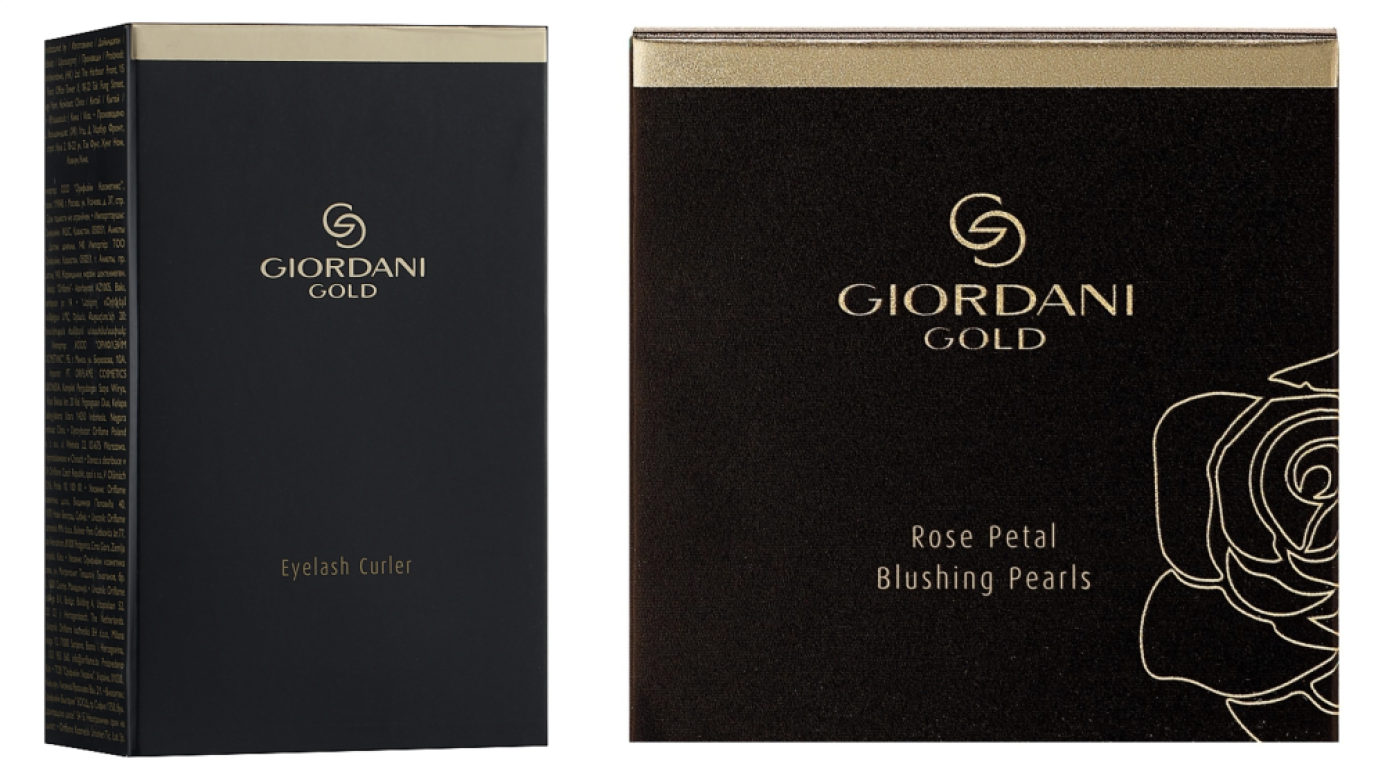
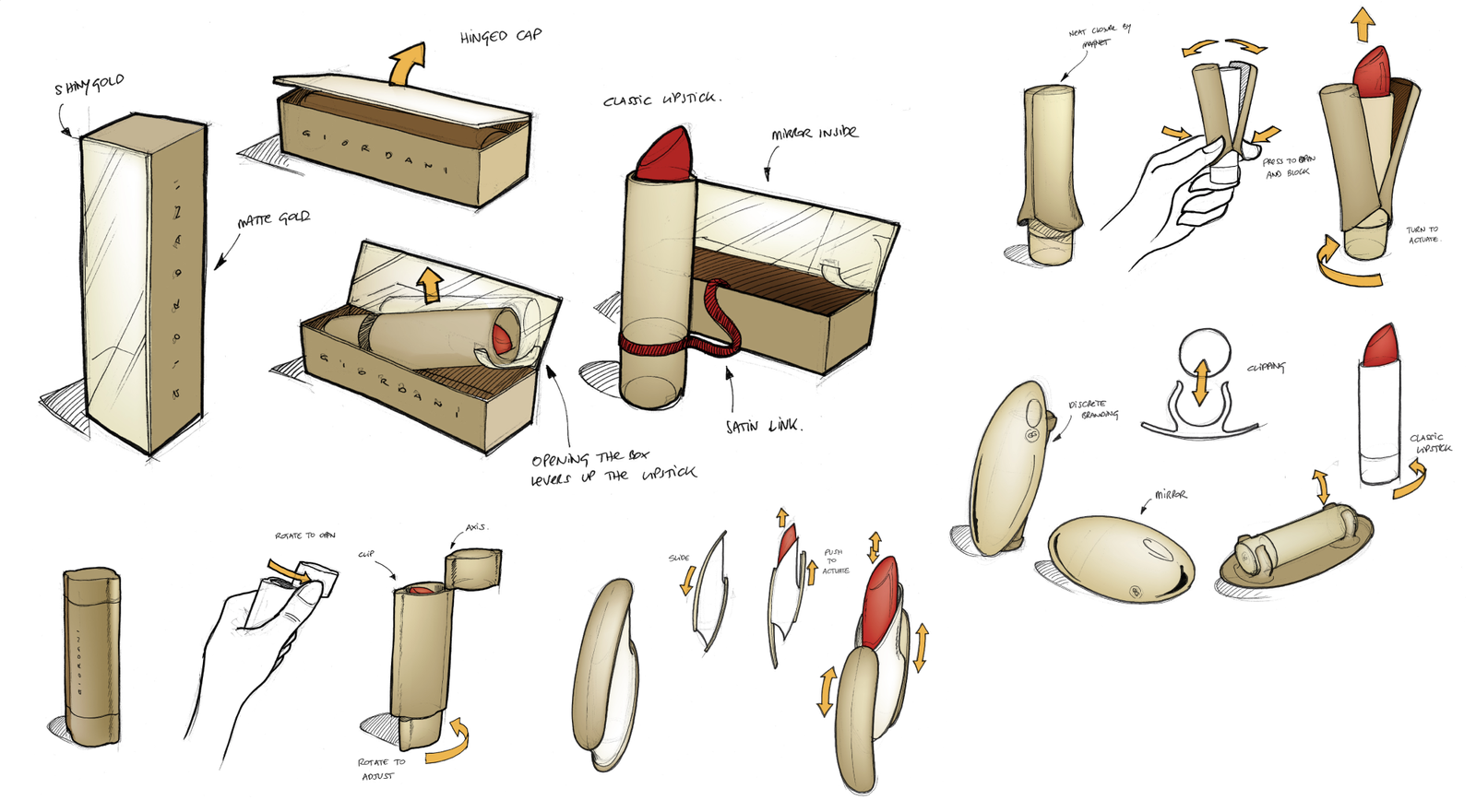
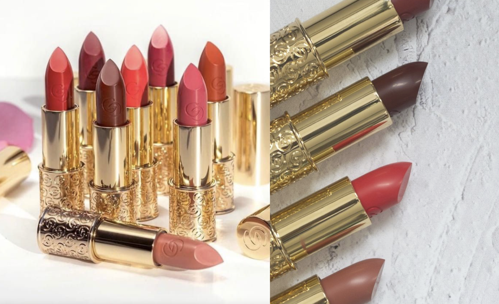
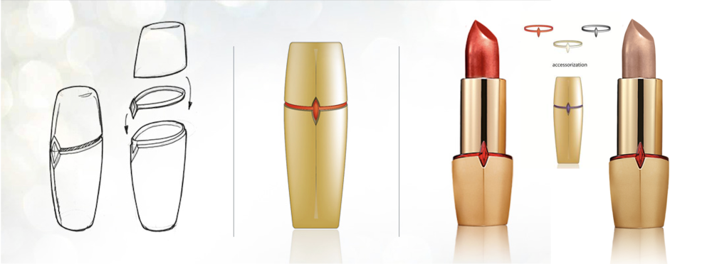
We were also asked to explore the relationship of structural design and packaging design by creating the right balance between belonging to the same family, yet being ‘precious and stimulating consumers to visually desire the product.
A new logotype and brand icon was crafted with the double GG icon, a monogram driving the perfect alliance of control & freedom.
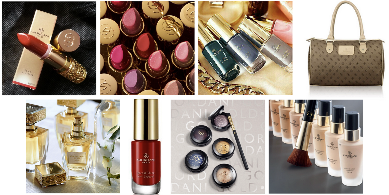
We translated our success factors into brand design by being:
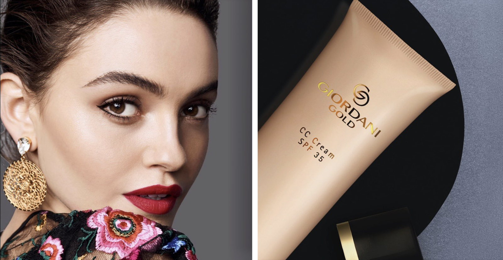
Feminine – Rejuvenating the brand image by bringing to life the ‘feminine impression’ concept in a timeless and distinctive design language.
Exclusive – Elevating the brand to drive a prestigious image by owning the gold colour in contrast with a secondary colour as well as imposing the brand as a notoriety in elegance, through a sophisticated design style across materials and precise attention to details.
